The Global Data Analytics Market has witnessed strong, continuous growth in the past few years and is projected to continue this same path. With the help of data analytics, organizations can now leverage data to extract valuable insights, which are used to create actionable decisions. In the past few years, data analytics has been broadly used to empower organizations to make the most profitable business choices. A recent market study shows that the Data Analytics Market is expected to grow at a CAGR of 30.08% from 2020 to 2023, which would equate to $77.6 billion. In 2019, the global analytics market was $49 billion worldwide, which is more than double the value four years ago.
Source: Market Reports
This program is the seventh and final step of the nano degree program on ‘Specialization in Data Analytics with PYTHON‘. In this course, students will start from scratch, in terms of visualizing their results and will implement some of the essential visualization libraries. Students will then be provided with enough information to work on advanced and more interactive visualization tools, even after the end of the course. Students will begin from plotting and marking figures and subplots. Students will then work on some basic features, including colours, markers, labels, ticks and legends. Then, after implementing the annotation and other function using ‘matplotlib’, students will work on a better solution of ‘seaborn’. Students will design line plots, bar plots, histograms, scatter plots point plots and will implement their multiple types. Students will work on categorical datasets and will implement relevant graph types for the same. Finally, students will be given extra resources, to jump to the more interactive libraries like Plotly and work on better visualization tools and available solutions.
The full course is divided into modules, with each module targeting some essential set of aspects.
The program is designed for students or professionals who are:
The program to give its best will need the following requirements:
[one_half first=]
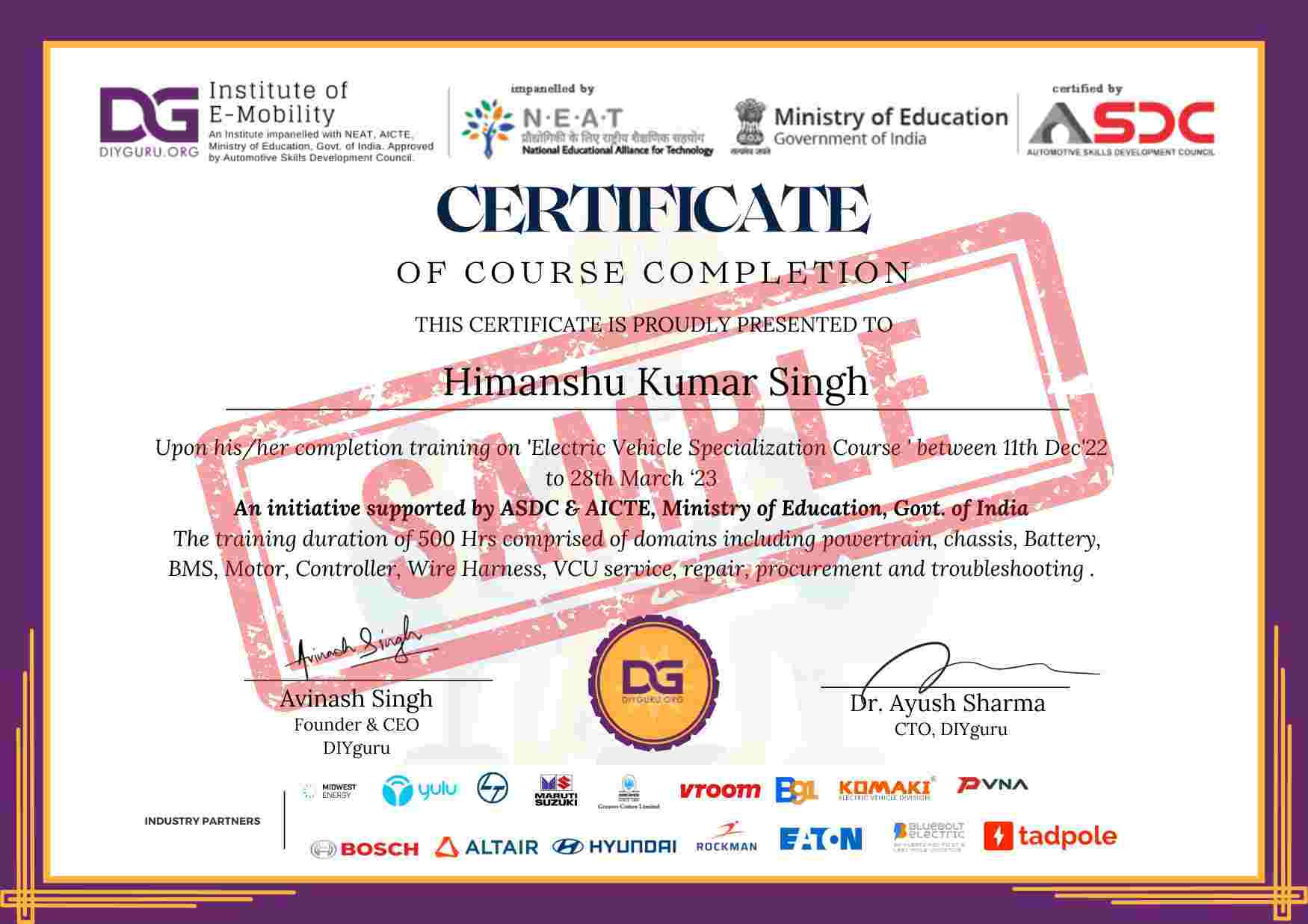
DIYguru will feel proud to awards the certificate of competency in ‘Data Visualization’ to only those aspirants who have 100% completed their online module.
DIYguru proficiency Certificate is highly valuable by industry giants namely Robert Bosch; Maruti Suzuki; Hyundai Motors, are the name of few, which is why DIYguru earned certificates are secured with a unique certificate ID. To check the validation of the certificate, check out the footer section of the home page.
Certificate provided to you is an online certificate, which means there is no need to download, after completion of the course, aspirants are requested to check their profile to view their earned certificate. In case the certificate is not issued feel free to write us a certificate@diyguru.in, our team will help you out.
[/one_half]
[one_half first=]

[/one_half]

"Very informative course, high quality in terms of quizzes and assignments, liked the project at the end of the course. Oh, and great support. Can recommend this one to my friends and colleaugues. Being the very first player in EV industry, DIYguru has been crucial to the EV ecosystem development in india"

"I have known DIYguru since 2013 when the first version Autosports india was launched and in last 6-8 years the platform has emerged as the leading maker's learning platform in india. Form me the team behind DIYguru has been the best support all through the journey after Bachelors till my master's"

"Some of the best customer service I've ever seen. Great platform for mechanical and electrical engineers to learn EV!"

"This is truly a 5 star experience for youngsters in india! keen to learn about EV Technology"

"The platform has helped me personally to build my career in renewable energy in Canada. Hope to see DIYguru in Canada soon. Five stars!"

"liked the course with wide range of calculations in EV, all tutors are very supportive."
"Automotive design with incredible knowledgebase in terms of support from Baja Tutor community of DIYguru is wonderful experience. Documentation on the web is also good. "

"Amazing content and great support from DIYguru community"

The Automotive Skills Development Council (ASDC) has launched an Electric Mobility Nanodegree course in association with DIYguru.


आप इलेक्ट्रिक कारों के मैकेनिक बन सकते हैं, वर्कशॉप खोल सकते हैं या फिर पार्ट्स से जुड़ा बिजनेस कर सकते हैं.

पेट्रोल-डीलज की बढ़ती कीमतों से आने वाले समय में निजात मिलने की उम्मीद.


The increasing shift towards EVs will create a massive demand-supply gap of EV technicians available to cater to the problems in electric vehicles.


374, MG Road, Delhi - 110030

5th floor, Ark-7, Near Prabhat Plaza, Station Road, Thane (West) – 400601

DIYguru COE, Ajeenkya DY Patil University, Lohegaon District, Pune – 412105
523, Gera’s Imperium Rise, Wipro Circle, Rajiv Gandhi Infotech Park, Hinjewadi Phase 2, Pune - 411057

DIYguru (KIUS), Hosur Main Road, Hombegowda Nagar, Bengaluru – 560029

No 06-01 Jalan Padan Ria 4, Pusat Perdagangan Padan, 81100 Johar Bahru

DIYguru, Vroom Services Limited, Level 6, Plot 10, Road 12, Block F, Niketan, Gulshan, Dhaka 1212.

DIYguru, Abhiyantriki Karmashala Pvt. Ltd. ward No. 06, Dadhikot, Suryabinayak, Bhaktapur, Nepal


Professionals from 70+ Companies use DIYguru Platform for Upskilling.